Light Curve Basics
The examples over at
lightkurve are really useful
for understanding all the wonderful ways you can access Kepler data
via online archives. This very short example demonstrates a
quick-and-dirty tool that uses lightkurve to download the entire
Kepler light curve for a particular star.
Download a light curve.
Our first step is to download some data. We’ll import our basic set of tools, and then use them to download a Kepler light curve.
In [ ]:
# let's import some common Python packages we like
import matplotlib.pyplot as plt, numpy as np

# let's also import our custom Python package for this class
import henrietta as hsl
This last command creates an object called hsl that contains a
useful function: download_kepler_lc. This function takes a star name
as input, and tries its best to return a Kepler light curve for it.
There are a few options you can feed it if you want, to know what those
are, remember that in jupyter you can type the name of a function,
and then hit <shift>-<tab> to see what it does (once for basic info,
twice for more). Give it a try!
In [ ]:
hsl.download_kepler_lc
Here, we use that function to download a light curve for Kepler-186. Light curves from Kepler are split into ~90 day quarters; this function makes a rough attempt at stitching all of those together.
In [ ]:
lc = hsl.download_kepler_lc('Kepler-186')
Plot your light curve.
The lc object we just created it is a KeplerLightCurve object
(see the documentation for lightkurve) if you want to know more
about what these objects can do). One snazzy feature of a light curve
object like this is that we can make a simple plot of the data, just by
running
In [ ]:
lc.plot()
You’ll notice that the folks who wrote this tool put a bit of thought into making sure the plot looks pretty good and the axes are labeled in a relatively straightforward way.
However, we might want to play around with things a bit, so let’s dig under the hood of our light curve, and pull out the actual data that’s being plotted.
In [ ]:
# this is the time, in something like Julian Date
time_in_days = lc.time

# this is the relative flux of the star, normalized to the star's median brightness
relative_flux = lc.flux
In [ ]:
N = len(time_in_days)
print("Our light curve contains {} data points!".format(N))
With these arrays, you can start playing around with real Kepler data, either for Kepler-186 or for any other star you choose!
Using lightkurve functions.
You just saw the light curve .plot() function. Beyond just that one,
there are oodles of built-in functions that we can call directly from
that lc object. Some are listed below, with explanations from
ASTR3400 students! You can also check out the original lightkurve
documentation over
here.
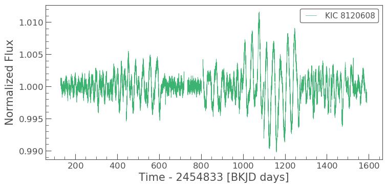
lc.plot()
Chris says “.plot() plots the light curve with the normalised flux
on the y-axis and the time in days on the x-axis.”
Sebastian added that “it acts much like matplotlib.pyplot.plot
works, which we are all more than familiar with due to ASTR2600. Any
kwargs that you could pass into matplotlib.pylot.plot also work with
.plot().”
In [7]:
lc.plot(color='mediumseagreen');
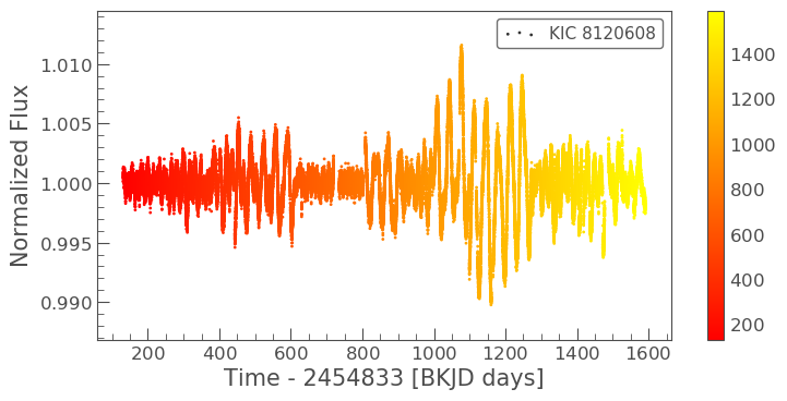
lc.scatter()
Zach says “.scatter() is almost the same as plot, but instead of
connecting each data point with a line, the data are plotted as discrete
points.”
Jon points out that it also takes keyword arguments to change the
plotting style, just like matplotlib.pyplot.scatter.
These keywords act slightly differently than the ones for plot.
Notably, with scatter the c= and s= keywords allow you to
set the color or size of different points with an array, as shown here.
In [8]:
lc.scatter(c=lc.time, cmap='autumn');
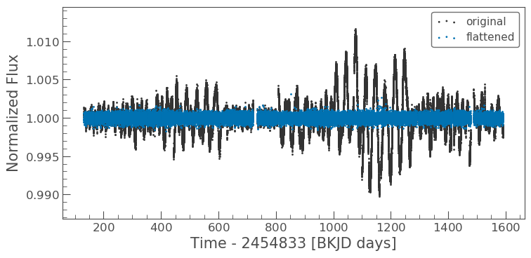
lc.flatten()
Diego says “The .flatten() function does exactly as one would
expect. Two graphs are shown for comparison. One is the regular one and
the other is flattened. This is helpful because flattening the graph can
get rid of the factors that influence the light curve that comes from
the star. Stars look brighter or dimmer depending on where its spots
are. This function makes it so the light curve does not reflect that
fact.”
Shae adds that .flatten() gets rid of wiggles in the light curve
“using a Savitzky–Golay filter (a smoothing technique)”.
Chris noticed that for his transits, “there seems to be a ‘lead up’ to
the transit coming from both sides like the
caldera of a volcano.” This
can be caused by the .flatten() function, because it tries to smooth
out everything as best it can and doesn’t know where your transits are,
it can sometimes overcorrect near transits.
In [9]:
# scatter a light curve
ax = lc.scatter(label='original')

# flatten and scatter a light curve
lc.flatten().scatter(label='flattened', ax=ax);
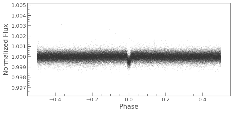
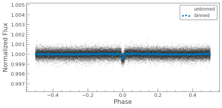
lc.fold()
Shae says “.fold() takes the data and folds it on itself, depending
on the specified period given. The y-axis remains as the normalized
flux, whereas the x-axis is the phase which represents the time within a
single period.”
Diego adds “The .fold() function takes all the data points and
shifts them all over to a certain time period. It is ‘folding’ in the
sense that the data is all piled into one ‘area’. This helps to show its
transit around its host star.”
In [10]:
# parameters for Kepler-186b
period = 3.8867907
t0 = 2454966.3304
t0_in_bkjd = t0 - 2454833

# flatten, fold, and scatter a light curve
lc.flatten().fold(period=period, phase=t0_in_bkjd/period).scatter(alpha=0.1);
lc.bin()
Zach says “The function .bin(binsize=int) takes a given number of
data points and averages them together, returning a new lightcurve with
fewer data points. It can be applied to a curve that has already been
processed by other functions like .fold().
Dana explains how it works “If you want a bin size of 50, this takes the first 50 flux measurements and averages them to give one data point, the second point is the second 50, and so on until the function reaches the end of the data.”
Sebastian adds “The process of binning leads to less noise in the data, allowing us to focus much more intensely on the actual patterns in the data that we care about.”
In [11]:
folded = lc.flatten().fold(period=period, phase=t0_in_bkjd/period)

# flatten, fold, and scatter a light curve
ax = folded.scatter(alpha=0.1, label='unbinned')

# flatten, fold, bin, and scatter a light curve
folded.bin(100).scatter(ax=ax, s=10, label='binned');
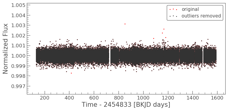
lc.remove_outliers()
Tyler says “.remove_outliers(sigma=5.0) removes the outliers from
the data set based on how many standard deviations the value is from the
trend. If done incorrectly it can remove transit data.” Setting
sigma to a larger value means that an outlier must be more extreme
to be removed.
Dana provides a nice example: “Say you have a list of numbers (3,5,7,2,45,7,9), and you use this function on that set of numbers, it would remove that 45 because it is an outlier and not close to the other numbers.”
In [12]:
# make a flattened light curve
flattened = lc.flatten()

# scatter the original flattened light curve
ax = flattened.scatter(label='original', color='red')

# scatter the flattened light curve after removing outliers
flattened.remove_outliers().scatter(ax=ax, label='outliers removed');
lc.yourownfunction()
Imagine about what other functions you might like to apply to a light
curve. We could write our own lightkurve functions. What would they
do? If you have an idea, share it with the class!