Basic Principles
Let’s imagine you want to do something slightly more complicated. Maybe you want to make a movie, and include an linked time series plot next to it. Maybe you want to include several movie frames at different cadences. Maybe you want to create your own snazzy custom format. To do so, there are three core concepts you need to understand.
a Sequence is a collection of data, with times
To make an animation, we need a data structure that has some kind of
data that has a time axis associated with it. For example, here we
make a Sequence out of a small postage stamp of imaging data.
In [1]:
from playground.tv import *
In [2]:
from playground.cartoons import create_test_stamp
stamp = create_test_stamp(N=10, seed=42)
The make_sequence function is a general wrapper that does a decent
job of figuring out what kind of sequence should be made out of the
given inputs.
In [3]:
seq = make_sequence(stamp)
make_sequence should be able to handle at least the following types
of input: + single FITS filename, and an ext_image= keyword for the
extension to use + list of FITS filenames, and an ext_image= keyword
+ a glob pattern to search for FITS files, and an ext_image= keyword
+ single FITS HDUList, and an ext_image= keyword + list of loaded
FITS HDULists, and an ext_image= keyword + a Stamp object from the
cosmics package
Each sequence has a .time attribute. It is an astropy.time
object, and can be indexed as an array. If times are fake (for example,
if they are simply image number or cadence number), then we pretend
(artificially) that the times are gps format with a cadence of 1s.
In [4]:
print("""
{}
 has {} times defined,
 spanning {}
       to {}
 with a cadence of {:.2}""".format(
    seq, len(seq.time), seq.time[0], seq.time[-1], seq.cadence().to('s')))
<stamp-sequence of 10 images>
 has 10 times defined,
 spanning 2018-01-01 00:00:00.000
       to 2018-01-01 00:00:18.000
 with a cadence of 2.0 s
Each sequence can be indexed directly with [i] to extract the
ith element of the dataset. Different types of sequences will
store data in different ways. For a small stamp, it will generally load
the entire 3D (x,y,t) dataset into memory. For a sequence of large FITS
images, it will generally only load individual FITS images on the fly as
needed, to preserve memory. These different background behaviors should
hopefully remain hidden to the casual user.
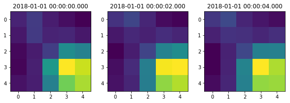
In [5]:
fi, ax = plt.subplots(1,3, figsize=(10,3))
for i in range(3):
    ax[i].imshow(seq[i])
    ax[i].set_title(seq.time[i])
a Frame is a plot panel, which can display a Sequence
A frame is a container in which a sequence can be displayed. Different
frames can display different views, even of the same dataset. For
example, here we create two different frames that include our little
sequence seq as their data.
In [6]:
normal = imshowFrame(name='cecelia',
                     data=seq)
normal
Out[6]:
<imshow Frame | data=<stamp-sequence of 10 images> | name=cecelia>
Below, we can create a different frame using the same data, but by
including the processingsteps keyword, it will subtract the mean
image from each individual image before displaying it.
In [7]:
subtracted = imshowFrame(name='henrietta',
                         data=seq,
                         title='(median subtracted)',
                         processingsteps=['subtractmean'])
subtracted
Out[7]:
<imshow Frame | data=<stamp-sequence of 10 images> | name=henrietta>
We will be able to visualize these frames once they are included in an illustration.
an Illustration is a collection of Frames, with its own layout
Once we have created our frames, we can include them in an illustration.
The illustration handles not only the basic grid layout of the frames,
but also synchronizing their frames when plotting an animation. When you
call the illustration’s .plot method, it will make all the
constituent frames plot too. When you call the .animate method,
it will make an animation by looping through a grid of times and
updating each frame whenever it needs updating.
In [ ]:
i = GenericIllustration(imshows=[normal, subtracted])
i.plot()
i.animate('_static/a-pair-of-frames.mp4')
Looking back at the normal and subtracted frames that we
defined, we can see a few features. The data and times for the two
frames are identical, so the images update synchronously at each
timestep of the animation. The subtracted frame looks like noise
scattered around 0, as we would expect for having subtracted off the
mean image. We gave subtracted a custom title, but normal fell
back on an initial best guess.
If you want, you can access the individual frames inside an illustration
through the .frames dictionary. This may come in handy if you want
to modify the attributes of a frame once it’s in an illustration, or
change something in how it is plotted after calling i.plot(). (See
examples below.)
In [9]:
print('{} contains {} frames: {})'.format(i, len(i.frames), list(i.frames.keys())))
<I"Generic"> contains 2 frames: ['cecelia', 'henrietta'])
By default, all image frames will share the same color mapping. We can
let each frame have its own color mapping by setting the illustration’s
sharecolorbar= keyword to False.
In [ ]:
i = GenericIllustration(imshows=[normal, subtracted], sharecolorbar=False)
i.plot()
i.animate('_static/a-pair-of-frames-with-different-colorbars.mp4')
If you’re trying to directly compare values across different frames,
keep sharecolorbar=True. If you’re looking for qualitative features
and want to highlight the details unique to each frame, let each have
its own colorbar. In this example, where the data were simulated to
represent photon counts, we can see that the noise in the difference
images is highest where the flux in the normal image is too.
some example Frame combinations
We can treat frames as somewhat modular containers, and build up illustrations through combinations of them. Here are a couple of examples of making custom illustrations by following the general process of 1. make some sequences 2. put them in frames 3. fill an illustration
simple ZoomFrame (recreating illustratefits)
Let’s start by recreating the zoom feature shown with illustratefits
in the quickstart.
In [ ]:
# first create a sequence
big = make_sequence(create_test_stamp(N=10, xsize=80, ysize=100))

# then define some frames
image = imshowFrame(name='big-image', data=big, title='imshow')
zoom = ZoomFrame(name='zoom', source=image, position=(25, 50), size=(20,10), title='zoom')

# then populate an illustration with them
i = GenericIllustration(imshows=[image, zoom])
i.plot()
#i.animate('_static/an-example-of-a-zoom.mp4', dpi=75)
f = i.frames['big-image']
multiple ZoomFrames on multiple images
Now, let’s build a bit on that by including both the original images and some median-subtracted ones. In addition to the extra frames, we’re also including some more complicated options in generating the illustration layout.
In [ ]:
# first create a sequence
big = make_sequence(create_test_stamp(N=10, xsize=80, ysize=100))

# then define some frames
image = imshowFrame(name='big-image', data=big, title='imshow')
zoom = ZoomFrame(name='zoom', source=image, position=(25, 50), size=(20,10), title='zoom')
subtracted = imshowFrame(name='big-subtracted', data=big, title='subtracted', processingsteps=['subtractmedian'])
subtractedzoom = ZoomFrame(name='zoom-subtracted', source=subtracted, position=(25, 50), size=(20,10), title='zoom')

# then populate an illustration with them
i = GenericIllustration(imshows=[image, zoom, subtracted, subtractedzoom], imshowrows=2,
                        figsize=(7,6), hspace=0.2, wspace=0.02,
                        left=0.05, right=0.95, bottom=0.05, top=0.9)
i.plot()
i.animate('_static/an-example-of-a-more-complicated-zoom.mp4', dpi=75)
an EmptyTimeseriesFrame linked to an imshowFrame
It might be nice to see a light curve synced up to the data from which
it is derived. The EmptyTimeseriesFrame provides us with an empty
frame, into which we can plot some time-series data. Here’s a first step
toward that capability; it still needs a bit of work, but hopefully this
is enough to get started. The basic idea is to create an available plot
location (an Axes object, in matplotlib-speak), where you can
fill later with whatever plot elements you like. The below example
demonstrates how to populate the time-series frame in two ways, both
using its built-in .plot function and simply by adding elements to
i.frames['timeseries'].ax.
In [ ]:
# make a dataset
star = make_sequence(create_test_stamp(N=25, xsize=10, ysize=10, single=True))

# create an empty time-series frame into which we will plot a timeseries
lightcurve = EmptyTimeseriesFrame(name='timeseries')
someimage = imshowFrame(name='image', data=star, title='', plotingredients=['image', 'arrows', 'colorbar'])

# create an illustration that positions these frames next to each other
i = SideBySideIllustration(timeseries=[lightcurve], imshows=[someimage])

# plotting the illustration creates the basic structure...
i.plot()

# ...but we can still modify it through the individual frames
f = i.frames['timeseries']

# the time-series f.plot plot will subtract a the illustration's shared time offset
time = star.time.jd
flux = star._gather_3d().sum(-1).sum(-1)
f.plot(time, flux, marker='o', color='black')

# the f.ax refers to the time-series axes, so this is how we set up to plot into it
plt.sca(f.ax)
plt.axhline(np.mean(flux), color='cornflowerblue', zorder=-1)
plt.ylabel('Some Flux')

i.animate('_static/an-example-of-a-timeseries.mp4')
The interface for plotting timeseries is still a little buggy and may change soon. For now, hopefully you find this helpful!
Some more examples are included, in one way or another, in the
tests/ directory of the playground repository. Check those out,
or please feel free to contribute new examples here! As always, please
do not hesitate to contact Zach
Berta-Thompson or leave an issue on
the gitlab repository.