We often want to visualize one or more exoplanet populations in fairly standard ways. Here we summarize some predefined visualizations for populations and explain how you can create your own multi-panel, multi-population visualizations with exoatlas.
import exoatlas as ea
import matplotlib.pyplot as plt
import astropy.units as u

ea.version()'0.7.8'We’ll modify the default plot aspect ratio, so they don’t take up too much space.
plt.rcParams["figure.figsize"] = (8, 3)Let’s generate some populations to visualize.
exoplanets = ea.TransitingExoplanets()
solar = ea.SolarSystem()
Make Your Own Plots with exoatlas Data
It is, of course, possible to make your own plots using data from exoatlas populations. You probably have some brilliant idea, and just working with the raw quantities might be where you want to start. Here’s a basic example.
# plot the exoplanets
x = exoplanets.relative_instellation()
y = exoplanets.radius()
plt.scatter(x, y, marker=".", s=5, alpha=0.5)

# plot the Solar System planets
x = solar.relative_instellation()
y = solar.radius()
plt.scatter(x, y, marker="s", s=30, color="black")

# adjust the plotting details
plt.xscale("log")
plt.yscale("log")
plt.xlabel("Bolometric Flux (relative to Earth)")
plt.ylabel("Planet Radius (Earth radii)")
plt.xlim(1e5, 1e-5);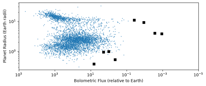
# plot the exoplanets with uncertainties
x = exoplanets.relative_instellation()
y = exoplanets.radius()
x_error = exoplanets.relative_instellation_uncertainty_lowerupper()
y_error = exoplanets.radius_uncertainty_lowerupper()
plt.errorbar(x, y, xerr=x_error, yerr=y_error, linewidth=0, elinewidth=1, alpha=0.5)

# plot the Solar System planets
x = solar.relative_instellation()
y = solar.radius()
plt.scatter(x, y, marker="s", s=30, color="black")

# adjust the plotting details
plt.xscale("log")
plt.yscale("log")
plt.xlabel("Bolometric Flux (relative to Earth)")
plt.ylabel("Planet Radius (Earth radii)")
plt.xlim(1e5, 1e-5);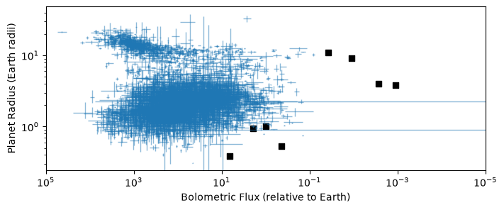
You can build up whatever beautiful, transparent, creative, and useful visualizations you want on your own.
However, often we may want to fill a panel with multiple different planet populations, and maybe even across multiple linked plots. That can be a little annoying to keep track of, so we tried to add a few shortcuts to make it easier to sets of quantities for groups of populations.
These tools are all contained within the exoatlas.visualizations module.
import exoatlas.visualizations as vi📏 Plottable 📏 objects prepare data for visualization
To get data ready for visualizing, a Plottable will generally define some of the following:
source= where does the quantity come from? This should be the name of a method that’s available for all the populations you might want to use.label= a human-friendly label. This may appear as axis labels or in figure legends.scale= are the data better displayed linearly or logarithmically? This will set the scale for x or y axes, or how colors or sizes are normalized.lim= what are reasonable limits? This would set default axis limits, or how colors and sizes are define their minimum and maximum values.**kw= ifsourceis a method that takes keyword arguments (such asteq(albedo_bond=..., f=...)), any additional keywords you provide when creating aPlottablewill get passed along to the method
Let’s create a few:
# specify everything
radius = vi.Plottable(
    source="radius",
    label="Planet Radius (Earth radii)",
    scale="log",
    lim=[0.3, 30],
    unit=u.Rearth,
)

# leave scale and limits as None, for auto-scaling
distance = vi.Plottable(source="distance", label="Distance (pc)")

# define scale and limits, but don't worry about a fancy label
teff = vi.Plottable(source="stellar_teff", scale="log", lim=[2500, 7500])

# pass keyword "wavelength" to quantity method
brightness = vi.Plottable(
    source="stellar_brightness", scale="linear", lim=[1e3, 1e9], wavelength=1 * u.micron
)
We indicate these variables as Plottable by a little ruler 📏, indicating each is ready to draw some data at the right locations on a plot.
radius, distance, brightness, teff(📏 radius, 📏 distance, 📏 stellar_brightness, 📏 stellar_teff)For a given population, it can retrieve values and symmetric or asymmetric uncertainties.
radius.value(exoplanets)radius.uncertainty(exoplanets)radius.uncertainty_lowerupper(exoplanets)(<Quantity [0.0317104 , 0.14771227, 0.22274965, ..., 0.00658918, 0.220229 ,
0.05249184] earthRad>,
<Quantity [0.02351617, 0.14667019, 0.26834947, ..., 0.00723724, 0.27284139,
0.03633396] earthRad>)We can also calculate normalized values, which may be useful for representing sizes or colors. The normalization will pay attention to the scale and lim keywords.
brightness.value(exoplanets)brightness.normalized_value(exoplanets)masked_array(data = [ 3.54847133e-01 1.14458563e-01 1.14458563e-01 ..., 2.92582428e-07
1.74106615e-06 3.92296425e-01],
mask = False,
fill_value = 1e+20)If we wanted to stop here, we could use these three Plottable objects to help create a plot. Practically, this isn’t much different from just making the plot ourselves from the raw data; basically it’s just the size normalization that’s helping.
mass_limit = 0.5 * u.Msun
is_lowmass = exoplanets.stellar_mass() < mass_limit
highmass = exoplanets[is_lowmass == False]
highmass.label = f"> {mass_limit}"
lowmass = exoplanets[is_lowmass]
lowmass.label = f"< {mass_limit}"

plt.figure()
for pop in [highmass, lowmass]:
    x = distance.value(pop)
    y = radius.value(pop)
    s = brightness.normalized_value(pop) * 1000
    plt.scatter(x, y, s=s, label=pop.label)
plt.xscale("log")
plt.yscale("log")
plt.xlabel(distance.label)
plt.ylabel(radius.label)
plt.legend(frameon=False, loc="upper left", bbox_to_anchor=(1, 1));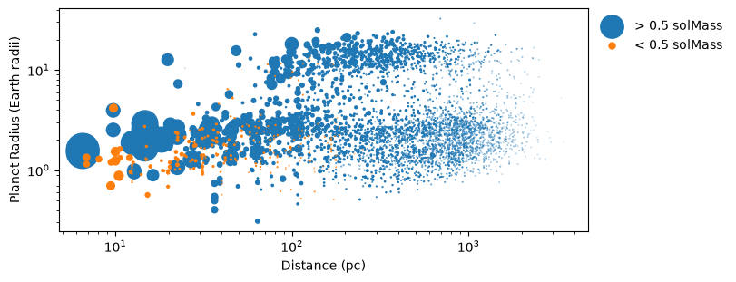
We provide a number of preset Plottable objects to use as visual components. These can be accessed directly as variables in vi, or as elements of the vi.preset_plottables dictionary.
vi.Flux()📏 relative_instellationfor k, v in vi.preset_plottables.items():
print(f"{k:>30} = {v()}") Flux = 📏 relative_instellation
RelativeInstellation = 📏 relative_instellation
LogRelativeInstellation = 📏 log_relative_instellation
Teq = 📏 teq
CumulativeXUVFlux = 📏 relative_cumulative_xuv_insolation
ImpactVelocity = 📏 impact_velocity
Radius = 📏 radius
LogRadius = 📏 log_relative_escape_velocity
Mass = 📏 mass
SemimajorAxis = 📏 semimajoraxis
AngularSeparation = 📏 angular_separation
Contrast = 📏 imaging_contrast
KludgedMass = 📏 kludge_mass
StellarTeff = 📏 stellar_teff
StellarLuminosity = 📏 stellar_luminosity
RelativeStellarLuminosity = 📏 relative_stellar_luminosity
LogRelativeStellarLuminosity = 📏 log_relative_stellar_luminosity
Distance = 📏 distance
EscapeVelocity = 📏 escape_velocity
RelativeEscapeVelocity = 📏 relative_escape_velocity
LogRelativeEscapeVelocity = 📏 log_relative_escape_velocity
EscapeParameter = 📏 escape_parameter
Density = 📏 density
StellarRadius = 📏 stellar_radius
Period = 📏 period
Gmag = 📏 magnitude_gaia
Depth = 📏 transit_depth
StellarBrightness = 📏 stellar_brightness
StellarBrightnessTelescope = 📏 stellar_brightness_in_telescope_units
DepthUncertainty = 📏 depth_uncertainty
DepthSNR = 📏 depth_snr
Transmission = 📏 transmission_signal
TransmissionSNR = 📏 transmission_snr
Reflection = 📏 reflection_signal
ReflectionSNR = 📏 reflection_snr
Emission = 📏 emission_signal
ReflectionToEmissionRatio = 📏 reflection_to_emission_ratio
EmissionSNR = 📏 emission_snr
RightAscension = 📏 ra
Declination = 📏 dec
🗺️ Map 🗺️ objects draw plots with plottables
With a Map, we can combine a few Plottable objects together to build up a plot. The Map is responsible for:
managing the figure and axes where data will be drawn
looping over populations and representing them
serving as a building block for multi-panel linked visualizations
The two main maps we use are BubbleMap for scatter plots and ErrorMap for including error bars.
BubbleMap for x, y, size, color
For basic scatter plots, we might try BubbleMap, where the four ways we might represent data are:
xaxis= bubble position along the x-axisyaxis= bubble position along the y-axissize= bubble area, based onnormalized_valuecolor= bubble color, based onnormalized_value, according to a colormap
Let’s try this with a basic example. We create a Map (🗺️) from two Plottable (📏) objects. We can use this Map to plot individual populations one-by-one with plot()...
bubble = vi.BubbleMap(xaxis=distance, yaxis=radius)
bubble.plot(highmass)
bubble.plot(lowmass)
plt.legend();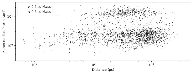
...or use build() to build up the plot by looping over populations.
bubble = vi.BubbleMap(xaxis=distance, yaxis=radius)
bubble.build([highmass, lowmass])
plt.legend();
Let’s use one more data dimension by having the size represent the brightness of the star as seen from Earth, using color simply to represent the two different populations.
bubble = vi.BubbleMap(xaxis=distance, yaxis=radius, size=brightness, color=None)
bubble.build([highmass, lowmass])
plt.legend();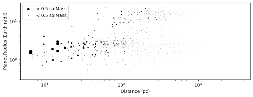
Or, if we’re focusing primarily on one Population, we might use color to represent another quantity. In the plot below, we can see that while stellar brightness at Earth (size) generally increases toward closer distances, stars with cooler stellar effective temperatures (color) have lower intrinsic luminosities and therefore appear less bright, even at nearby distances.
bubble = vi.BubbleMap(xaxis=distance, yaxis=radius, size=brightness, color=teff)
bubble.plot(exoplanets)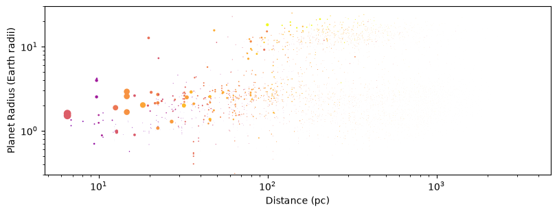
ErrorMap for x, y with uncertainties
Including errorbars on exoplanet population data can get tricky because planets can have wildly heteroscedastic uncertainties. If we just plot errorbars for all data points equally, our eyes are visually drawn to the largest uncertainties, while we’d like them to do the opposite: focus in on the best data! As such, in the ErrorMap we by default scale the intensity of errorbars to visually emphasize the points with the smallest uncertainties.
error = vi.ErrorMap(xaxis=distance, yaxis=radius)
error.plot(exoplanets)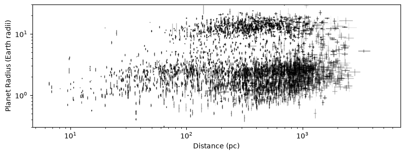
We provide some preset Maps objects to use as visual components. These can be accessed directly as variables in vi, or as elements of the vi.preset_maps dictionary. Some of these maps have extra functions defined inside of them, like for plotting habitable zones or models.
vi.Flux_x_Radius()🖼️ Flux_x_Radius
x = 📏 relative_instellation
y = 📏 radiusfor k, v in vi.preset_maps.items():
print(f"{k} =\n{v()}")Flux_x_Radius =
🖼️ Flux_x_Radius
     x = 📏 relative_instellation
     y = 📏 radius
Flux_x_Teff =
🖼️ Flux_x_Teff
x = 📏 relative_instellation
y = 📏 stellar_teff
SemimajorAxis_x_StellarLuminosity =
🖼️ SemimajorAxis_x_StellarLuminosity
x = 📏 semimajoraxis
y = 📏 stellar_luminosity
Distance_x_Radius =
🖼️ Distance_x_Radius
x = 📏 distance
y = 📏 radius
Distance_x_Teff =
🖼️ Distance_x_Teff
x = 📏 distance
y = 📏 stellar_teff
EscapeParameter_x_Radius =
🖼️ EscapeParameter_x_Radius
x = 📏 escape_parameter
y = 📏 radius
Density_x_Radius =
🖼️ Density_x_Radius
x = 📏 density
y = 📏 radius
StellarRadius_x_PlanetRadius =
🖼️ StellarRadius_x_PlanetRadius
x = 📏 stellar_radius
y = 📏 radius
Depth_x_Radius =
🖼️ Depth_x_Radius
x = 📏 transit_depth
y = 📏 radius
Transmission_x_Radius =
🖼️ Transmission_x_Radius
x = 📏 transmission_signal
y = 📏 radius
Reflection_x_Radius =
🖼️ Reflection_x_Radius
x = 📏 reflection_signal
y = 📏 radius
Emission_x_Radius =
🖼️ Emission_x_Radius
x = 📏 emission_signal
y = 📏 radius
Distance_x_Brightness =
🖼️ Distance_x_Brightness
x = 📏 distance
y = 📏 stellar_brightness_in_telescope_units
Depth_x_Brightness =
🖼️ Depth_x_Brightness
x = 📏 transit_depth
y = 📏 stellar_brightness_in_telescope_units
Transmission_x_Brightness =
🖼️ Transmission_x_Brightness
x = 📏 transmission_signal
y = 📏 stellar_brightness_in_telescope_units
Reflection_x_Brightness =
🖼️ Reflection_x_Brightness
x = 📏 reflection_signal
y = 📏 stellar_brightness_in_telescope_units
Emission_x_Brightness =
🖼️ Emission_x_Brightness
x = 📏 emission_signal
y = 📏 stellar_brightness_in_telescope_units
Period_x_Radius =
🖼️ Period_x_Radius
x = 📏 period
y = 📏 radius
SemimajorAxis_x_Radius =
🖼️ SemimajorAxis_x_Radius
x = 📏 semimajoraxis
y = 📏 radius
SemimajorAxis_x_Mass =
🖼️ SemimajorAxis_x_Mass
x = 📏 semimajoraxis
y = 📏 kludge_mass
Mass_x_Radius =
🖼️ Mass_x_Radius
x = 📏 mass
y = 📏 radius
Mass_x_EscapeVelocity =
🖼️ Mass_x_EscapeVelocity
x = 📏 mass
y = 📏 escape_velocity
Flux_x_EscapeVelocity =
🖼️ Flux_x_EscapeVelocity
x = 📏 relative_instellation
y = 📏 escape_velocity
EscapeVelocity_x_Flux =
🖼️ EscapeVelocity_x_Flux
x = 📏 escape_velocity
y = 📏 relative_instellation
EscapeVelocity_x_CumulativeXUVFlux =
🖼️ EscapeVelocity_x_CumulativeXUVFlux
x = 📏 escape_velocity
y = 📏 relative_cumulative_xuv_insolation
CumulativeXUVFlux_x_EscapeVelocity =
🖼️ CumulativeXUVFlux_x_EscapeVelocity
x = 📏 relative_cumulative_xuv_insolation
y = 📏 escape_velocity
ImpactVelocity_x_EscapeVelocity =
🖼️ ImpactVelocity_x_EscapeVelocity
x = 📏 impact_velocity
y = 📏 escape_velocity
RA_x_Dec =
🖼️ RA_x_Dec
x = 📏 ra
y = 📏 dec
🖼️ Gallery 🖼️ objects collects maps together
Often, we may want to look at multiple plots side-by-side, to see how trends in one view might relate to other properties. A Gallery can be built up from a collection of Map objects, like this. Let’s add one more planet population for comparison, and then look at a few examples.
neat_planet = exoplanets["HD209458b"]
neat_planet.color = "magenta"
neat_planet.s = 400
neat_planet.zorder = 1e20
neat_planet.alpha = 1
neat_planet.bubble_anyway = True
neat_planet.outlined = True
neat_planet.filled = False
Let’s start by creating a Gallery from a list of Map objects, which will then be organized and built into a multipanel plot. For example, let’s try to make an approximate version of a “cosmic shoreline” plot, including a few extra Solar System populations.
dwarfs = ea.SolarSystemDwarfPlanets()
moons = ea.SolarSystemMoons()
# create the column of panels
shorelines = vi.Gallery(
maps=[vi.EscapeVelocity_x_Flux(), vi.EscapeVelocity_x_CumulativeXUVFlux()],
horizontal=False,
figsize=(6, 8),
)
# populate the plots with data
shorelines.build([solar, dwarfs, moons, exoplanets, neat_planet])
# add some curves and make some adjustments to the maps
for p in shorelines.maps.values():
plt.sca(p.ax)
p.plot_shoreline()
p.plot_jeans_shoreline()
plt.ylim(1e-4, 1e4)
plt.xlim(0.1, 1000)
p.add_legend(fontsize=7)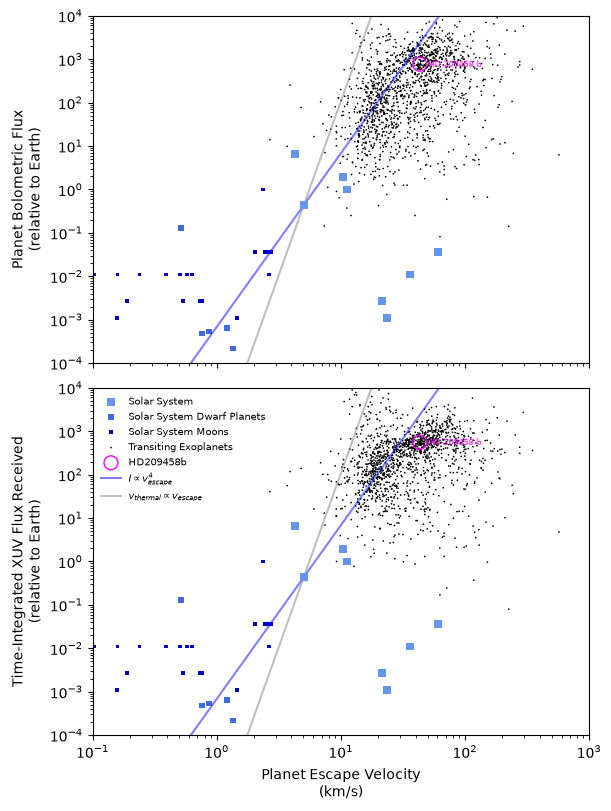
Next, let’s try TransitGallery, a preset Gallery that works well for transiting exoplanet populations.
row = vi.FourPanelTransitGallery()
row.build([exoplanets, solar, neat_planet])
row.maps["mass_x_radius"].add_legend()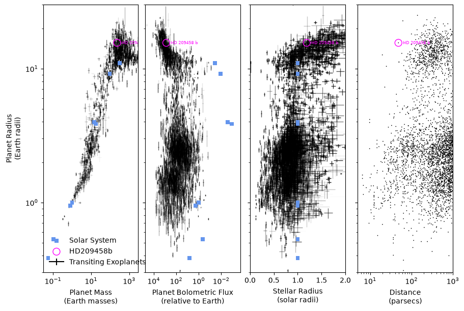
The definition of TransitGallery effectively just chooses a few default Map objects to include. Let’s make a similar one on our own, with just the first two panels, to see how that’d work.
row = vi.Gallery(maps=[vi.Mass_x_Radius(), vi.Flux_x_Radius()])
row.build([exoplanets, solar, neat_planet])
row.maps["mass_x_radius"].add_legend()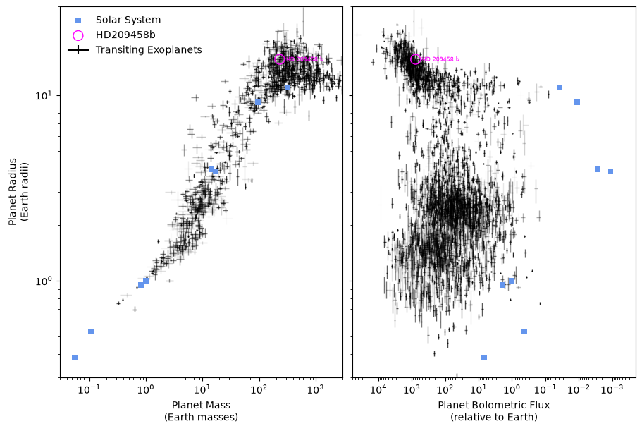
The GridGallery can be used to specify a grid of maps with shared x and y axes, starting from the Plottable quantities you want along each row and column.
k = ea.Kepler()
t = ea.TESS()
o = ea.TransitingExoplanets() - k - t
o.label = "Other"
grid = vi.GridGallery(
    rows=[vi.Declination, vi.Radius], cols=[vi.RightAscension, vi.Flux]
)
grid.build([o, k, t])
grid.maps["relative_instellation_x_dec"].add_legend()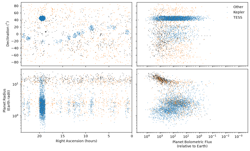
Arbitrarily complicated custom Gallery definitions can be created by overwriting the .setup_maps and .refine_maps methods. That’s how PlanetGallery and EverythingGallery were made!
vi.PlanetGallery().build([solar, exoplanets, neat_planet])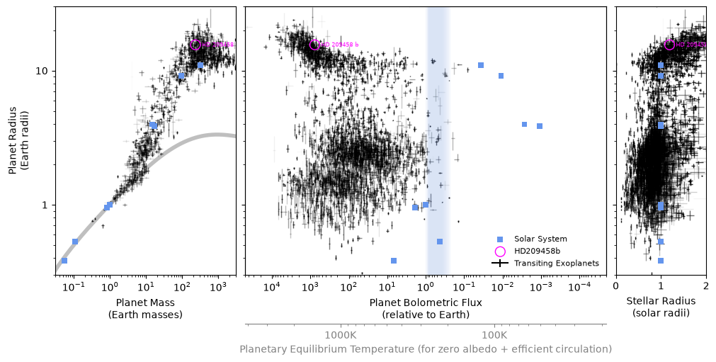
all_planets = ea.get_all_planets()
all_planets["neat"] = neat_planet
vi.EverythingGallery().build(all_planets)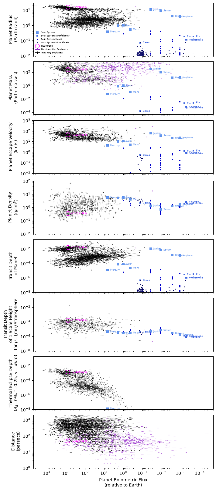
These examples are not entirely exhaustive, but hopefully they give you a little taste of what might be possible using exoatlas for visualizations!